
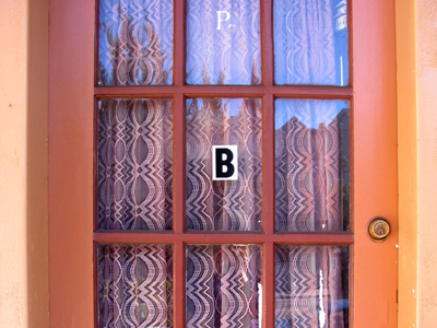
at first i only noticed the B and liked how centered it was. then i noticed the fading P (or B perhaps) and liked it even more. a peanut butter door!
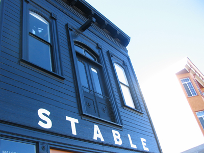
yummy and beautiful cafe on folsom st.
lettering
robert ryan
sarah gardner. i like this one especially.
and found through sarah's flickr faves: sarah nicholl's drawings, and gemma correll's and oski's
type
i love typography

No comments:
Post a Comment