Wednesday, September 27, 2006
in between days
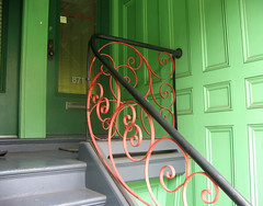
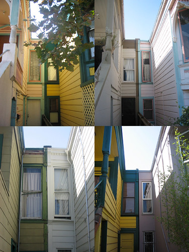
here are some skinny windows in between houses. i like how skinny, mismatched and shoved up against each other they are.
seeing as i'm in between jobs, i am going to take a little (maybe 2 week?) blogging break to try to focus more on looking for jobs, going to school and making some new cards. if i start going batty though, i may be back on here sooner rather than later. also am going to try not to look at your blogs so much, so i'll catch up on commenting when i get back to blogging. see you in a bit!
Tuesday, September 26, 2006
two more artists: sarah haba and lisa solomon
sarah haba is a friend from college who i recently met up with again this week. her work is in the cole cafe right now. i love the light in her paintings. there is something haunting about them too. her paintings are featured here on apartment therapy.
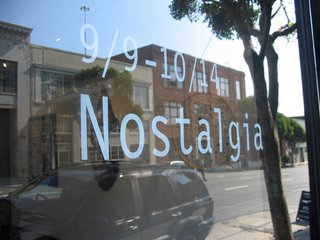
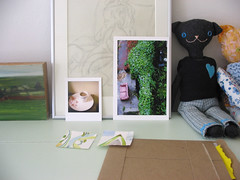
and of course you know fellow blogger lisa solomon. i went to see her wonderful artwork in the nostalgia (front window picture above) show at aftermodern. (now i want to go to her show at limn too.) the nostalgia show is in a cool, modern building that is just small enough to feel intimate, which is appropriate for the art there right now i think. i liked that there was a relationship with the other artists' work there despite the fact that the mediums were all different. (i know they're supposed to have nostalgia in common, but often shows don't really seem that cohesive despite a theme, which is fine with me too actually. but interesting when there is a relationship that can be found/made.)
another artist in the nostalgia show, lisa kokin, makes these elaborate, dense button pieces. this was my favorite (and least dense) of hers. it's much more interesting in person because you can see all the strange buttons that are strung/sewn across the hula hoop.
if you're in sf, check these out!
oh, and on the theme of nostalgia, here's a line i like from a book i just read, the sea, by john banville:
The past beats inside me like a second heart.
Sunday, September 24, 2006
erica gatts
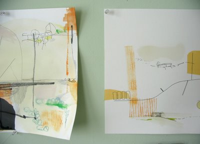
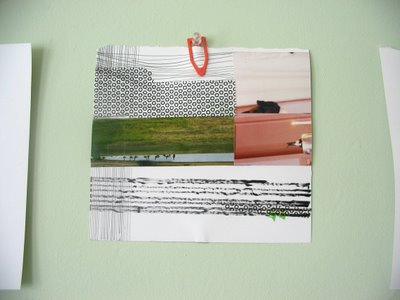
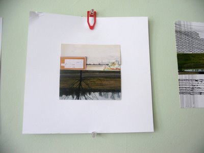
above and below are pieces of art by my housemate and friend erica gatts (whose hair is much longer and curlier now). i snuck into her studio and took photos, and then asked if i could post them here.
erica is an architect/artist. she makes exquisite, architectural drawings at bars and cafes on napkins or whatever paper is on hand. she makes collages/paintings from old photos, scraps of things, plastic, paint and drawings. disassembling and assembling. layering. i love art with many layers (figurative and literal). secrets and discoveries.
Saturday, September 23, 2006
take me to the library
quote from juan ramon jimenez at the beginning of blue shoe by anne lamott:
I am not I.
I am this one
walking beside me whom I do not see,
whom at times I manage to visit,
and whom at other times I forget;
who remains calm and silent while I talk,
and forgives, gently, when I hate,
who walks where I am not,
who will remain standing when I die.
i like this quote.
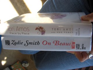
i finally went to the local public library branch recently. i don't know why i'd never been there before. actually, i do know. it's cuz i like to own books i read. but in an effort not to spend so much money, i decided to do the library thing. i had forgotten how fabulous libraries are. a warm place for people to come in and read/relax/get information/borrow books! for free. what a concept. i think there should be libraries for borrowing other things for free as well. power tools, sewing machines, hula hoops, etc.
i love the crinkly noise the plastic cover makes when you open and close a library book.
i like finding notes scribbled in the book or tucked inside. i like the coffee stains.
i was in my library reverie until i realized, library books no longer have the sheath with the card inside that shows the names and dates of who has borrowed the book and when! that's so much of the magic of checking out books at the library lost. i loved seeing a bit of the path of the book. and in a small town, i bet you could learn a bit about your neighbors from this little card. i guess it might be nice not to have the card there if you are checking out something risque or private. i can see an upside. but it still makes me sad. even just the act of checking out the library book and having the librarian stamp the card. i don't know why that was so satisfying. i think stamping things is just satisfying for some reason.
that card was similar to mail art or citycarshare art. the passing on of something from one stranger to the next. a record of something shared, but in absence. (my housemate erica was in a citycarshare car the other day that had a little handmade book in it. some other carshare user had created this book for carshare users to fill. what a rad idea!)
i'm pretty sad about banishment of card catalogues from libraries too. but that's another rant.
ps. i just read alica's post, the tiny bit, that also is a library-loving one. for other novel readers especially, this is an interesting post.
Friday, September 22, 2006
friday flickr faves: animals
seems there's a theme this week.
this guy KNOWs he's gotten away with something.
what a sweet face
two looking out
helping kitty smell the flowers?
looks like a painting to me
i love this pic, and that the cat's name is snorri. (i think snorri is another of pinky leon's cousins.)
and of course. this cute booty.
Wednesday, September 20, 2006
feelin' groovy movie
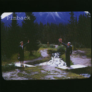
a pinback album cover
yesterday i was laying in the sun on the floor in my studio listening to pinback and watching the reflections on my ceiling when cars drove by on the street. it was SO groovy and relaxing.
pinback to me is like jane's addiction all mellowed out. their repetitive music is kind of meditative. and these ceiling reflections. you can't get the feel for them that well on the movie because i can't get the whole ceiling in the picture, but they move across from one side to another. like cloud windows passing over.
pinback + reflections movie
if you turn up your volume, you can hear some of the music too. best reflections happen at around 15 seconds.
(sidenote: jane's addiction takes me back to junior year of high school driving around during the lunch break in sarah johnson's parents' old cadillac or buick - one of those big american boat cars with the steering wheel that just spins around and around. sitting 3 to a seat in the front where it's just one long, hot leather seat. it would be some version of sarah, jamie, charlotte, laurel and myself in there. there'd be a lot of cussing and badassness on the part of sarah and jamie. charlotte was pretty badass too, but in a more controlled way. windows down, jane's addiction blasting. as i recall, sarah was a bit of a crazy driver as well. of us nerds, sarah and jamie were probably the most badass/f**k authority of us, though chris cones and i did refuse to say and to stand for the pledge of allegiance {or was it the national anthem?}at graduation. anyway, i still listen to and love jane's addiction, especially when i want to get in touch with the high school angst-filled rebel in me.)
Tuesday, September 19, 2006
ciao
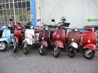
ah, vespas. those italians make a nice scooter.
graphic design-ish links:
anthony sheret. i like the sound/image one especially. the history of mail looks interesting too.
related site: juant
auf auf i like kippe redesign. i'm a sucker for big sans serif font like that. the hearts are nice too.
amazing treehouse from bang at flickr
woollyhoodwinks they're even cuter in real life.
Sunday, September 17, 2006
job interviews, pools and plates
oy. had a job interview friday at a cooperative bakery i like. i think i botched the interview. i got so nervous, twitchy and inarticulate. and i said some just stupid stuff. i even forgot what i'd been asked a few times. i managed to in turn both ramble and answer abruptly. nerves. what can you do. yoga i guess.
speaking of exercise, i miss swimming at the ucsf pool. (and i miss the sauna even more!) i'm trying the local parks and rec pool out. it's longer, which is good. and outdoors, which is both good (sunlight) and bad (will get cold). the floor is tiled, and it's pretty to look at the sun/shadow patterns on the floor while swimming. it gets really wavy, which i'd like to say is cool/more natural, but it sucks when you go to take a breath and catch a wave in your mouth. and the lanes are too wide. there are only two lanes! too many people swimming around each other/narrowly avoiding kicking each other in the head. the main problem however, is the locker room. it's somewhat swampy (ew). and no place to hang anything (shampoo, towel) in the shower. and of course, no sauna. but i'm not ready to fork over a bunch of moola for 24 hour fitness or the like yet.
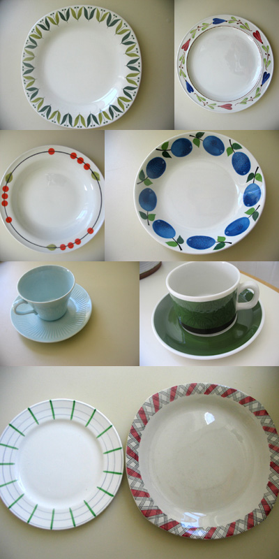
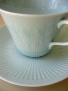
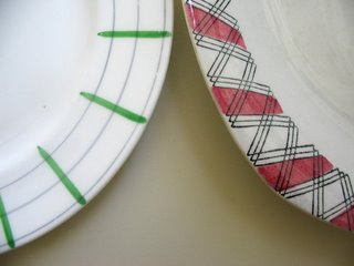
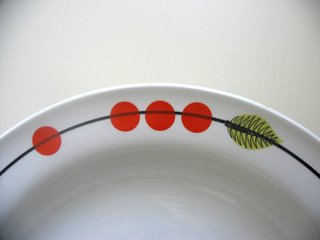
bugheart gwen inspired me with all her RAD collections and collection collages. the above photo is part of my collection of swedish plates. every time i go back, i go to the used plate store and buy a few plates. it's hard to choose because there are so many beautiful patterns. some of the above i'm no longer that excited about. it's challenging to pack plates for transatlantic travel. i spose i could ship them, but thus far i've managed not to break any plates in travel.
here is a closeup of the bluebells on the blaklocka cup.
and another plate closeup.
and one last.
a swedish online thrift store
Friday, September 15, 2006
flickr 500
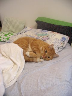
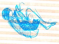
above is a bad sketch of how pinky tried to sleep on me last night. (i moved after 15 minutes or so). although it was uncomfortable and rendered me temporarily immobile, and although he was flapping me in the face with his tail every so often, he was actually welcome. i couldn't relax and get warm last night. had 3 layers of blankets and it's not even winter yet! as soon as pinky leon decided to sleep this way though, i had to laugh and think about him, and that relaxed/warmed me. that and he is a little heater.
i'm borrowing TWO of mav's ideas today. (hope you don't mind mav!) she just has such good ideas.
the first, is simply to note one's 500th flickr fave. noted!
the second, is to watch a slideshow of one's faves and tell you something of what was learned/noticed/felt.
it was very hard to choose favorites, since they're all favorites, and honestly there are some that might make me feel more than some of these do, but it's not anything i can articulate. and then there are so many photos that remind me of someone or some place or a specific memory. i'm not going to tell you about all that because it's not so meaningful to anyone else.
i realized the pictures i like are those that i feel like i am in. their tangibilty transports me. i can feel the wetness, the sun. usually it is because of the photo's atmosphere or mood.
speaking of mav, i love this photo of hers. it is so calm, gathered and ready to begin. the light looks like fresh morning light.
this one always makes me smile. it makes me think of how pets try to understand/be with us people. and it just looks like a fun time.
nyra's polaroid is perfect. it's so tranquil and the water so smooth. and you know in less time than it takes for the polaroid to come out, that water will be broken. the moment of it.
all about atmosphere here and now.
what to say about this one. it is so clearly a grandmother's home.
this room makes me think of stillness in travel (remember that REM song?)
i love it when people seem to know they're being photographed, but they are just so relaxed and themselves at that moment, that it doesn't affect them. makes me feel comfortable too. this one is also like that.
perfect braid photo
the quiet
i'm not sure what it is about lisa solomon's diptych
seems like a fairytale land. the mystery of horses and how they seem to be sharing knowledge.
cat persistence (to come full circle to the beginning of this post...)
Thursday, September 14, 2006
looking down
the two photos in the center are by simply photo jen. i received them in the photoswap she organized when my swap partner's photos were lost in the mail. i love them! her photos are just beautiful.
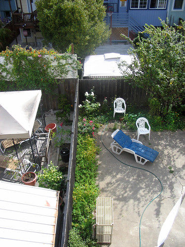
i think the hedge one on the right probably inspired my backyard one of a couple posts ago. i am really liking aerial photos these days. like the one above and like jenny vorwaller's italy photos from above.
and all the feet photos and teacup photos (more on those tomorrow) people take.
and of course, yann arthus-bertrand's earth from above. (i saw this exhibit when it was in stockholm outdoors. the photos are huge. and the text that describes them eye-opening. everyone just walked around looking at the art transfixed.) on the site (which is a bit confusing), it says of the captions that go with the photos:
each written by an expert on sustainable development. the light they shed on individual photographs reveals their essence and worth - that of precisely documented testimony on the state of the Earth, a heritage both beautiful and fragile we must all endeavor to preserve.
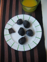
here are some figs and chocolate seen from above as well. ;-) dessert yesterday.
tomorrow when i reach 500 flickr faves, i may do something similar to what mav did.
Tuesday, September 12, 2006
loose ends
thank you those who commented on my last post and indulged with me in some dreaming...
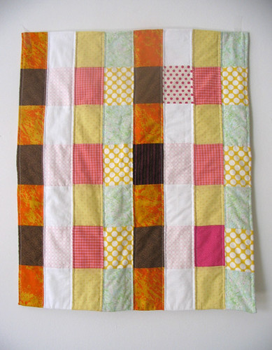
above is a quilt i am just finishing up. pieced it some time ago. the colors are inspired by the royal tenenbaums movie. i decided to machine quilt it even though my machine's tension is screwy. it's a bit bunchy, but all of the sudden i just wanted to get it done.
i'm about halfway done handquilting this one. i have 2 more quilt ideas brewing, but i'm thinking maybe i should finish this quilt too while i'm in this finishing mood. it's been sitting in the cupboard for over a year.
Sunday, September 10, 2006
what do you say?
couldn't stay warm friday/saturday. seriously considered turning on the heat. but today the sun shone bright and hot. oh SF, how fickle you are.
today i had brunch with the charming and talented jess hutchison. and she was yet another person talking of tiring a bit of the city life. the day before it was my friend laurel, talking of old farmhouses and big yards/open space in iowa. and before that, liz missing small town community. and me of course, pining for green and feeling worn down by the noise, trash, poo-covered sidewalks, surly hipsters, crazy drivers and people moving too fast to listen (myself included in those last two sometimes {i use citycarshare}).
so how bout this? how about all the artsy, poor, nice people move to some place green and affordable? en masse we could convert the red state conservatives to queer-loving, people-of-color- loving folks. we could form art collectives, build some ecofriendly houses, have the occasional art show/potluck/concert and invite the townsfolk. bike around town and down country lanes to the lake. bake pies. rock in the porch swing. hang out at the diner where everyone is a regular and they serve hash browns (not spiced, cubed potatoes like they do here). what other stereotypical small town activities can i conjure? but seriously, we want the culture and liberalism AND the rolling hills, community and affordability....are you in people? are you in?
uh oh. erica just turned on check your head. those boys are ON FIRE. i still love those beasties. time to dance in the house.
Friday, September 08, 2006
friday flickr faves + good stuff
i love this photo of karin's. that tablecloth is so summery. and those cups. just after fika.
remembering treeclimbing when little.
this looks so peaceful. i want to lie down there.
links:
danish posters - neato
metro logos from around the world. the swedish underground (tunnelbana which directly translated is tunnel rail or tunnel track) is the T in the third row from the bottom inside a circle and a square.
daily type cool!!
old silkscreen instuctions (pdf)
oh and just found irina troitskaya. wow. also on flickr. check out the bear and bird story.
happy weekend!
Wednesday, September 06, 2006
i can breathe!
finally they have removed the scaffolding from our house. it's been up for over a month even though the painters only painted for about a week out of that month. this is how our landlord does things. i wouldn't be complaining if the house turned out the above color, but alas that is someone else's house. ours is tan with brown trim. an ugly tan.
they had netting around the scaffolding, which made the flat dark. it's amazing how dependent i am on light. when i look at a place to live, light is always on the top of my requirements list. another creepy thing was that the scaffolding went right up to our windows, which don't lock. one evening i was taking out the trash and found a man clinging to the bottom of the scaffolding and eyeballing the levels. for like 5 minutes at least. he looked like he was considering a breakin or maybe a nap. anyhow, i'm so glad the scaffolding is gone! the curtains are up and the sun is pouring in. horay!
time to do some sewing before school. hand quilting takes forever. i'm thinking about investing in a new sewing machine. but i'm not ready for sewing machine advice yet, so i'll ask you dear sewing readers for it later.
i need to get some cds to replace old tapes. specifically lately i've been wanting:
the dirty dancing soundtrack(s)
abba
the cure
the sundays
also want:
antony and the johnsons
screamin' jay hawkins
Monday, September 04, 2006
Saturday, September 02, 2006
beige
thursday was my last day of my job of 6.5 years. it was both exciting and sad. friday some friends and i celebrated at la rondalla, a local dive mexican restaurant. very decorated. very good strawberry margaritas. very loud. it was a raucous time. there was even some stripping (not by me)!
it seems whenever my housemate erica and i go to la rondalla, we end up at the beauty bar after. (this time only about half of the patrons looked like ramones.) we did a quick dance to some excellent music and took some overexposed photobooth pics. we look very tan and shiny in the pictures. not so flattering. but we also did our best jerri blank impressions, so that made them extra ugly.
above is the much calmer scene in erica's room. (hope she'll forgive my surreptitious phototaking in her room.)
we just finished watching the royal tenenbaums for the fifth or so time. that wes anderson makes the most beautiful movies. they're like paintings. or shadowboxes. so many framed scenes in his movies. people in windows, in buildings, in ships. the sets are amazing. every time i see the royal tenenbaums i like it more. it's so poignant and funny and romantic. well written and perfectly cast. perfect font and perfect music choice and perfect colors.
have a good long weekend.